Hey there, fellow data wranglers and chart whisperers! Ever stared at a chart and thought, "This could use a little more pizzazz"? Maybe those sharp corners feel like they're judging you for not getting enough sleep. Or perhaps you've squinted at axis labels so tiny they seem more like ancient runes than helpful data points. Fret not, because Tractorscope is here to sprinkle a bit of magic (and some seriously cool updates) into your data visualization journey!
Version 2: The New Kid on the Charting Block
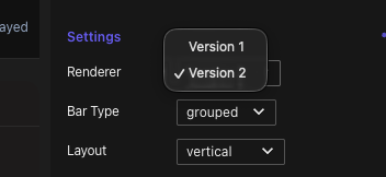
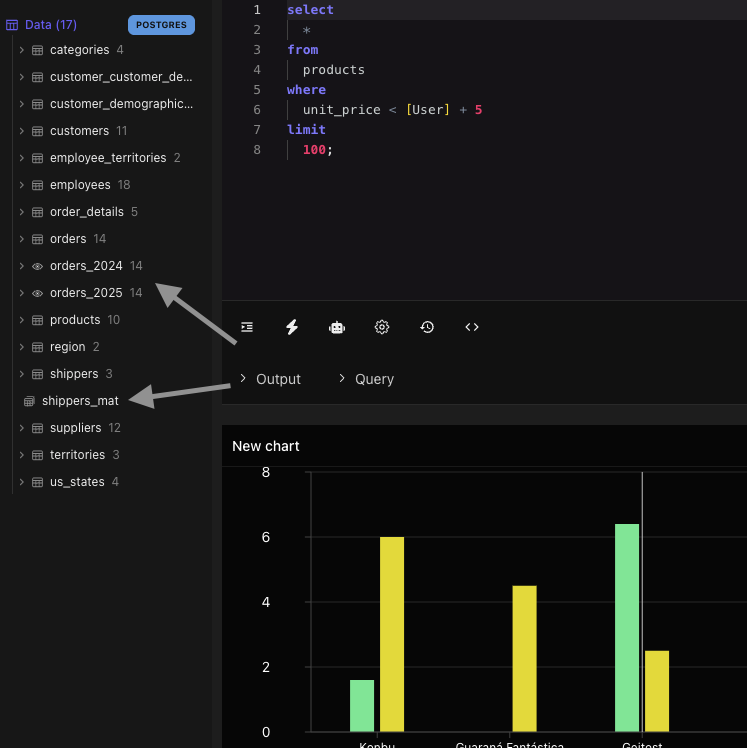
Say hello to Version 2, the charting engine that's here to revolutionize your data game. New charts now default to this version, offering enhanced features and eye-catching improvements right out of the box.
Why You’ll Love It: Whether you're a seasoned data guru or a newbie, these advanced charting capabilities make your data look like a million bucks (without the hefty price tag).
Practical Use Case: You're tasked with creating a dashboard for a marketing campaign. With Version 2, your visuals aren't just functional—they're fabulous, helping you tell a compelling story that captivates and convinces.
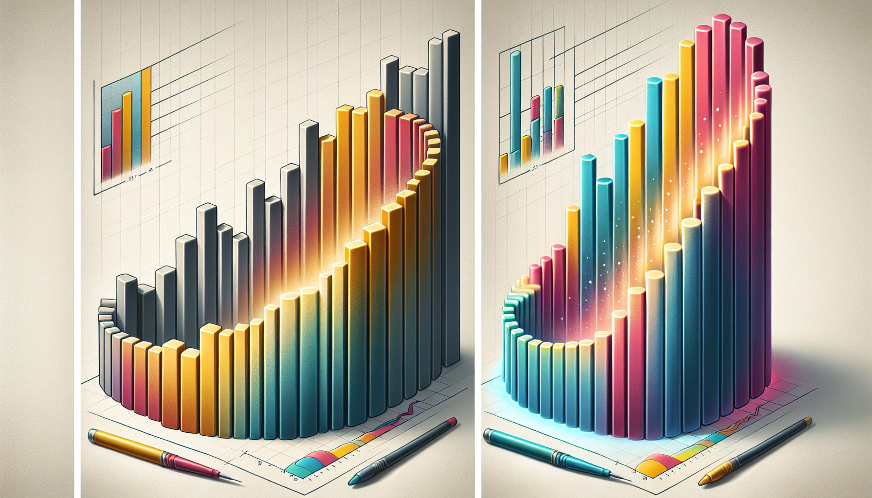
Rounded Corners: Because Why Should Charts Have It Rough?
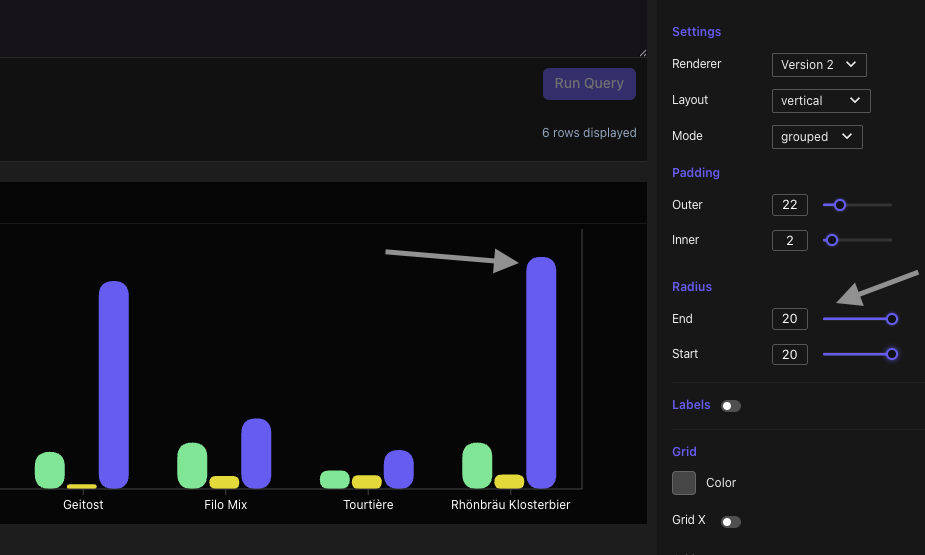
First up, let's talk about those rounded corners. Our latest update gives your charts a makeover that would make even a square peg feel well-rounded. With enhanced chart customization, we've polished the rendering of rounded corners across various chart types. The result? A more visually appealing and consistent look that makes your data dance, not drag.
Practical Use Case: Imagine you're presenting quarterly sales data to stakeholders. With these sleek, rounded edges, your charts will look as polished as your pitch. No more sharp corners stealing the spotlight!
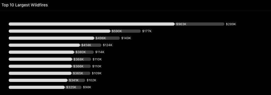
Axis Customization: Because Size (and Color) Matters
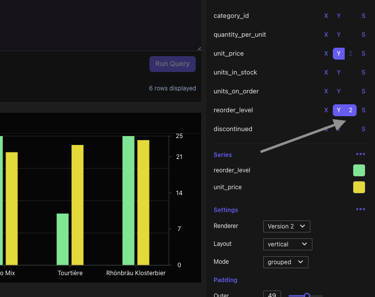
If you've ever struggled with axis labels that seem to be written in a secret code, we've got your back. Our improved axis customization now includes better font sizing, color selection, and support for a secondary Y-axis (Y2).
Benefit to You: This means your charts are not just readable, but stylish too. Dynamic font scaling ensures your labels are as clear as your insights.
Practical Use Case: Picture yourself analyzing customer demographics with multiple data points. The secondary Y-axis feature lets you display additional information without clutter, making interpretation a breeze.
Schema Sync Enhancements: Views Have Entered the Chat
Ever felt like your database views were the black sheep of the family? Not anymore! Our schema sync enhancements now include support for views and materialized views, making data management smoother than ever.
Why It’s a Game-Changer: You can now manage and visualize these views with ease, ensuring your database interaction is as seamless as your favorite streaming service.
Practical Use Case: Whether you're a data engineer or analyst, this feature streamlines your workflow, allowing you to focus on what truly matters—the insights.
SEO and Accessibility: Because Everyone Deserves a Seat at the Table
Last but definitely not least, we've amped up our SEO and accessibility game. With refined SEO titles, alt text, and ARIA labels, your content is more discoverable and accessible to all users.
The Big Win: Improved accessibility and search engine optimization mean your charts aren't just pretty—they're also more impactful.
Practical Use Case: You're publishing a report on your company’s website. These enhancements ensure it reaches a wider audience while being inclusive and user-friendly.
Dive Into the Data Visualization Future
These updates are designed with you in mind, making your data visualization experience not just effective, but enjoyable. As AI-powered visualization tools and design systems emphasizing accessibility become the norm, staying ahead of the curve has never been more important. So, why not take these features for a spin and see how they can transform your data stories?
Now, go ahead and give these features a whirl. Share your creations with us or let us know how these updates have made your data day brighter. Until next time, keep your charts rounded, your axes readable, and your data stories compelling. Happy charting!