Hey there, data viz enthusiasts! Ever find yourself knee-deep in a data visualization project only to feel like you're drowning in a sea of charts and filters? We've all been there. It's like trying to find a needle in a haystack, except the haystack is your endless dataset. But fear not, because Tractorscope has had a busy week, and we've rolled out a pile of updates that will make your data exploration smoother than ever — including a SQL error helper that suggests the actual fix.
Enhanced Chart Filter Handling: Smoother Sails Ahead
Let's start with a game-changer: Enhanced Chart Filter Handling. If you've ever spent more time wrestling with your chart filters than actually analyzing your data, this one's for you. We've refactored the chart filter handling and improved state management—fancy talk for making it work better and faster.
What does this mean for you? Smoother and more intuitive interactions with chart filters. Imagine gliding through your data with the ease of a hot knife through butter, getting to those all-important insights without any hiccups. Whether you're fine-tuning your financial dashboard or analyzing IoT data streams, this update ensures you're spending less time cursing at your screen and more time putting your insights to work.
The AI Query Assistant Stopped Handing You Markdown
If you've been using the AI Query Assistant since we shipped it, you probably hit this: you ask for a query, the assistant gives you a beautiful answer wrapped in a fenced code block, and when you hit Apply Query you get three backticks and the word
That's fixed. The assistant now cleans every response before it lands in the editor. It strips fenced code blocks (
The cleanup runs in two places: when a streamed response finishes, and again when you click Apply Query. So whether you're reading the suggestion first or trusting it blindly, what reaches your editor is a query, not a chat transcript. Same treatment in the compact assistant panel, too.
SQL Error Helper: "Help With This Error"
This one's our favorite. Every SQL editor eventually shows you a wall of red text that says something like
Query errors now render in a proper panel — a Query Error Occurred header, the raw database message in monospace so you can actually read it, and a tucked-away link in the corner: Help with this error. Click it and Tractorscope sends the error and the query that caused it to the AI, which comes back with three things:
- A plain-English explanation of what went wrong
- A short list of suggestions for fixing it
- A corrected query, rendered in a Monaco editor using the same theme as your SQL editor, so it looks like home
From there you can Copy it, Apply it to the editor, or Apply & Run it and watch the chart redraw. No tab-switching, no pasting error strings into a search engine.
And when the AI isn't available, it doesn't just shrug. There's a local analyzer that recognizes the classics on its own — object-not-found, syntax errors, ambiguous column references, and
The helper only shows up in the chart editor, where you can actually act on it. Your embedded and shared charts stay clean.
Data Explorer Row Limitation: Less is More
Next up, we've got a fix that trims data explorer results to a flat 100 rows. If you’re dealing with large datasets, you know the struggle of waiting for your computer to catch up. With our new row limitation, your queries will return a manageable amount of data, so you can quickly get to the heart of your analysis without bogging down your system.
Think of it as decluttering your workspace. You wouldn’t try to work at a desk covered in papers, right? The same goes for your data. By keeping your results tidy and focused, you can enhance the application's responsiveness and reduce memory usage. It’s all about efficiency, baby!
Schema Sidebar Data Explorer: Your New Best Friend
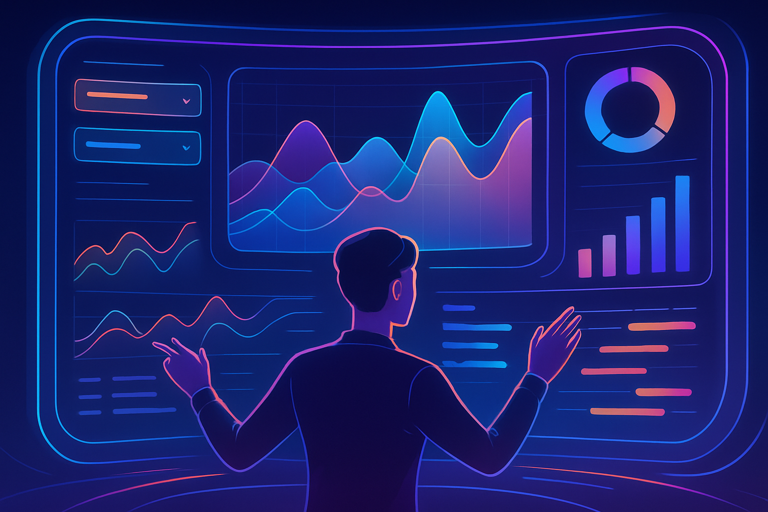
Finally, we've introduced a data explorer feature for schema sidebar tables. Ever wish you could explore data directly from the sidebar without losing your place? Well, now you can. This feature lets you access and analyze data without navigating away from the current view. It's like having your cake and eating it too.
Picture this: You're deep into a data storytelling session, crafting that perfect narrative for your audience. With our updated sidebar, you can seamlessly integrate data into your story, making it more relatable and easier to digest. Whether you're presenting to your team or creating customer-facing content, this feature ensures you're always in the driver's seat.

Number Overlays: The Headline On Top of the Chart
Line and bar charts are great at showing shape, but sometimes the thing your audience actually needs is the number. Total revenue. Average session length. Peak concurrent users. So we added number overlays to both line and bar charts.
Turn it on in a chart's settings, pick a series, and choose what to compute — sum, average, count, min, or max. Then make it yours: pick a corner, set the font size and weight, choose colors and a background pill, adjust padding, corner radius, and opacity, and format the value like any other number in Tractorscope (precision, comma separators, currency, and so on). You can have it push the chart down to make room or float over the top, with or without an animated count-up.
It's a KPI tile and a trend line in a single chart, which means one fewer widget to lay out on your dashboard.
List or Grid: Your Charts, Your Way
The charts index got a real overhaul. There's now a list/grid toggle in the toolbar — grid when you want to see chart previews at a glance, list when you've got two hundred charts and you just need to find the one called "weekly churn." Your choice sticks between sessions.
Alongside it: search by name, filter by chart type, filter by database, and sort. Small stuff individually, but together it's the difference between browsing your charts and hunting for them.
Embeds That Don't Fight Your CSS
If you embed Tractorscope charts in your own app, two things got meaningfully better.
First, CSS isolation. Embedded charts now render inside a properly isolated container, so your host site's global styles stop leaking in and rearranging our tooltips — and ours stop leaking out into yours. If you've ever embedded a chart and watched a stray
Second, signed filters. Embeds now carry a signed signature that includes their filter configuration, so an embedded chart can ship with filters locked to exactly the slice of data you intend — and viewers can't tamper with them by editing a URL. There's a new preview panel in the share modal that shows you precisely what an embed will look like, filters and all, before you paste the snippet.
Under the Hood: A Much Faster Screenshot Service
Not everything ships with a UI. The service that renders chart and dashboard thumbnails got rebuilt on Bun this week:
You'll never click a button for this one. You'll just notice your dashboards look right sooner.
Trends Shaping the Data Viz World
Speaking of staying in the loop, let’s take a quick detour into some of the latest trends in data visualization:
1. New Visualization Techniques and Libraries: Have you heard of "VizFlow"? It's the new JavaScript library everyone's talking about. Perfect for real-time data updates, it integrates smoothly with frameworks like React and Vue.js. Imagine live financial dashboards that adapt as data streams in—game changer, right?
2. Data Storytelling Trends: AI-driven narratives are the new black. They adjust stories based on your audience’s preferences, making your presentations more engaging and impactful. It’s all about making data stories more relatable.
3. Dashboard Design Patterns: Minimalist designs are making a comeback. With mobile-responsive designs in demand, focusing on clarity and usability has never been more crucial. Soft color palettes and intuitive navigation are the name of the game.
These trends are not just buzzwords—they're shaping the way we interact with data. So keep your eyes peeled as they continue to unfold!
Let's Keep the Conversation Going
So, there you have it. A whole week of updates that promise to make your data visualization experience as smooth as a well-oiled machine — from an error helper that actually helps, to number overlays, to embeds that finally leave your CSS alone. But we're just getting started. We love hearing from you, our community of data enthusiasts. Got thoughts on these updates, or ideas for future ones? Don’t be a stranger—drop us a line in the comments or hit us up on social media.
And remember, whether you're a data newbie or a seasoned pro, we're here to help you navigate the ever-evolving world of data visualization. Until next time, keep exploring, keep analyzing, and most importantly, keep having fun with your data!